A luxury interior color palette isn’t about finding “the perfect beige” or copying whatever is trending this year. Professional designers treat color as a system: it has to work with architecture, light, materials, and the client’s lifestyle—then still look intentional five to ten years from now. That’s why modern luxury colors tend to feel calm, restrained, and deeply considered.
Below is how pros choose high-end interior color schemes for neutral luxury interiors, with a focus on balance, restraint, contrast, psychology, and long-term visual impact.
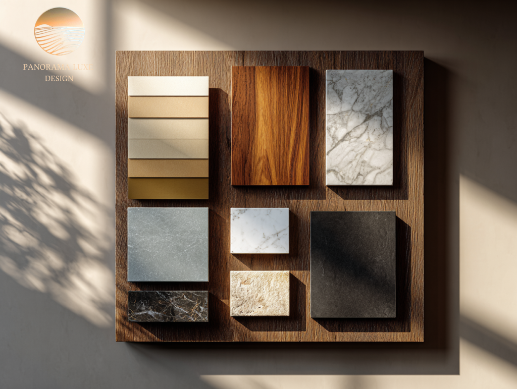
1- Start with what can’t be changed: architecture + fixed finishes
- Designers don’t pick paint first. They start with the “hard truths” of the space:
- Flooring tone (warm oak vs. cool walnut vs. gray stone)
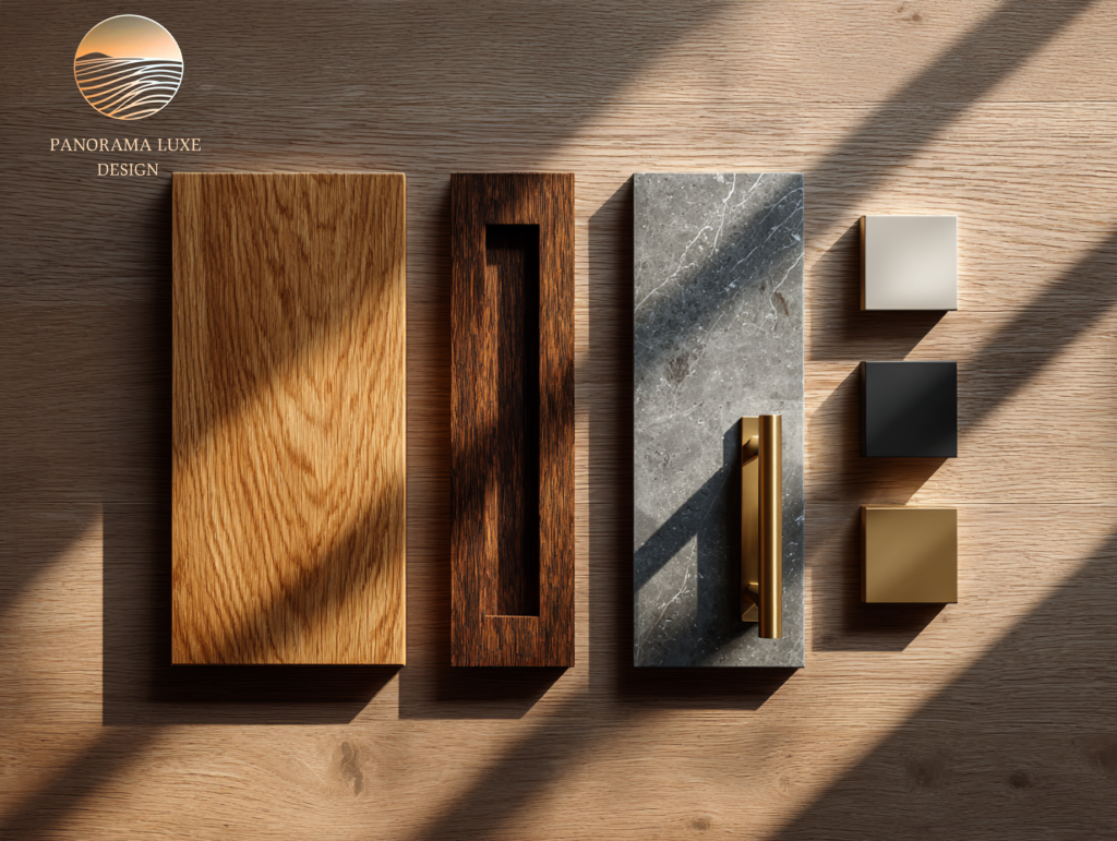
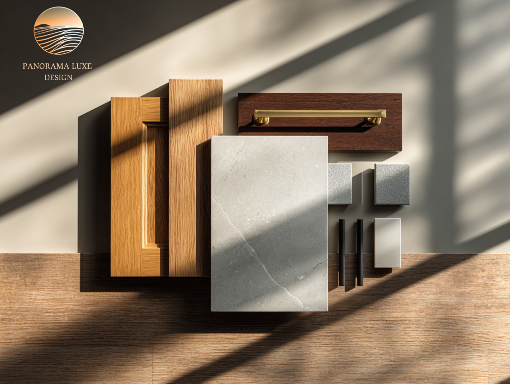
- Stone/backsplash veining and undertones
- Cabinet color and metal finishes
- Window orientation and daylight quality
- Ceiling height, trim style, and architectural lines
Luxury comes from harmony. If your fixed finishes lean warm and you force cool whites, the room will always feel slightly “off.” Pros choose a palette that supports the bones of the home, not one that fights them.
Practical move: Identify the dominant undertone in your largest fixed surface (floor or stone). That undertone becomes your anchor.
2-Build the palette around one “hero neutral,” not five competing ones:
A common mistake in neutral luxury interiors is using multiple neutrals that don’t share undertones: a creamy wall, gray sofa, taupe rug, and stark white trim. Nothing is technically “wrong,” but the room feels busy Designers typically choose:

- One hero neutral (walls or large upholstery)
- One supporting neutral (trim/ceiling or secondary upholstery)
- One deep tone (contrast color)
- One metal (finish family)
- One muted accent (optional, used sparingly)
This is where modern luxury colors live: limited palette, repeated intentionally.
Rule of restraint: If you can’t name your palette in one sentence, it’s probably too complicated.
3- Control value contrast (light vs. dark) before you obsess over hue
Luxury interiors feel expensive partly because the contrast is deliberate. Designers think in values (how light or dark something reads) first, then hue.
A simple way pros manage it:
- Keep large areas within a tight value range for calm
- Add depth with one or two darker “bookends” (e.g., charcoal, espresso, bronze)
- Use crisp highlights (e.g., warm white ceiling/trim, light stone, soft ivory textiles)
Long-term impact: Value contrast ages better than trendy color. A room can stay timeless even if the accent hue changes, as long as the value structure is strong.
4-Make undertones behave: warm, cool, or neutral—choose a lane
Luxury palettes fail when undertones clash. Pros “undertone map” everything:
- Warm: cream, ivory, camel, honey oak, brass, travertine
- Cool: crisp white, blue-gray, blackened metals, cool marbles
- True neutral: harder to achieve; usually built by balancing warm + cool materials
- Designer approach: Pick an undertone direction for the base (warm or cool), then introduce the opposite undertone only through small, controlled accents.
Example: Warm greige walls + warm white trim + natural oak + tiny cool black accents. Not the other way around.
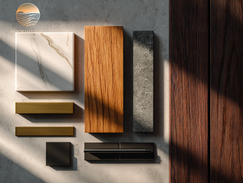
5- Use texture and sheen to create richness without adding more color
A luxury interior color palette can be 90% neutral and still feel layered—if texture is doing the heavy lifting.
Designers rely on:
- Matte walls + slightly higher-sheen trim (subtle hierarchy)
- Linen, wool, boucle, leather (natural depth)
- Stone with movement (quiet pattern)
- Wood grain (warmth without “color”)
- Metal accents (light-catching punctuation)
High-end trick: Repeat materials at least twice. One brass object looks random; brass used in lighting + hardware looks intentional.
6-Psychology: luxury feels calm, confident, and not needy
Color psychology in luxury design isn’t about “blue is relaxing” clichés. It’s about emotional tone and visual noise.
- Too many distinct colors reads as restless.
- Overly bright colors can feel youthful or casual (not always bad, just not “luxury modern” by default).
- Muted, complex tones feel sophisticated because they change subtly with light.
Designers aim for a mood:
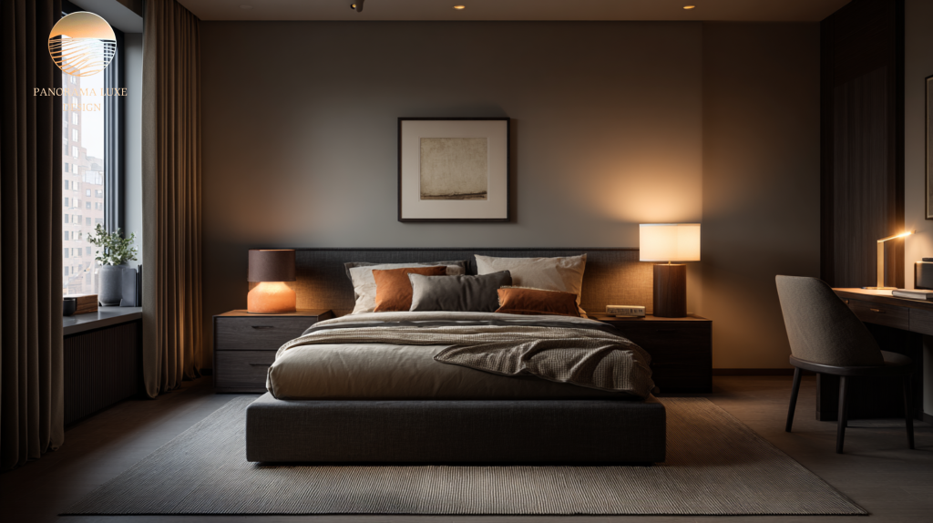
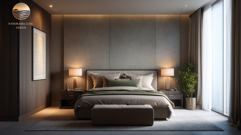
- Quiet and grounded (warm neutrals + earthy depth)
- Clean and architectural (cool whites + charcoal/black)
- Plush and intimate (deep tones + soft highlights)
Decision-based tip: Choose the emotional goal first, then pick colors that support it. That’s how you avoid trend-chasing.
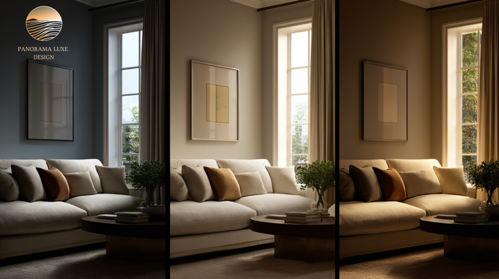
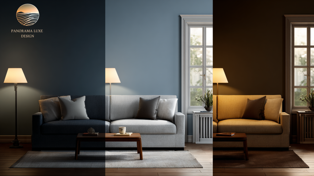
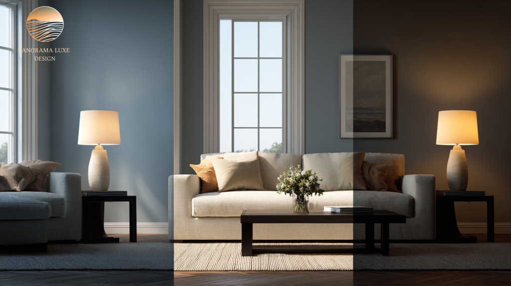
7- Plan for real life: lighting shifts, seasons, and “color fatigue”
Professionals test palettes like they’re stress-testing a product.
They consider:
- Daylight vs. evening warm artificial light
- North-facing cool light that exaggerates grays
- South-facing warm light that can yellow creams
- How the palette reads on cloudy days, not just sunny ones
They also avoid “color fatigue” by keeping strong hues off massive surfaces. If you love a bold color, place it on something replaceable (art, a chair, a throw) rather than every wall.
Reality check: The more permanent the surface, the more neutral and forgiving it should be.
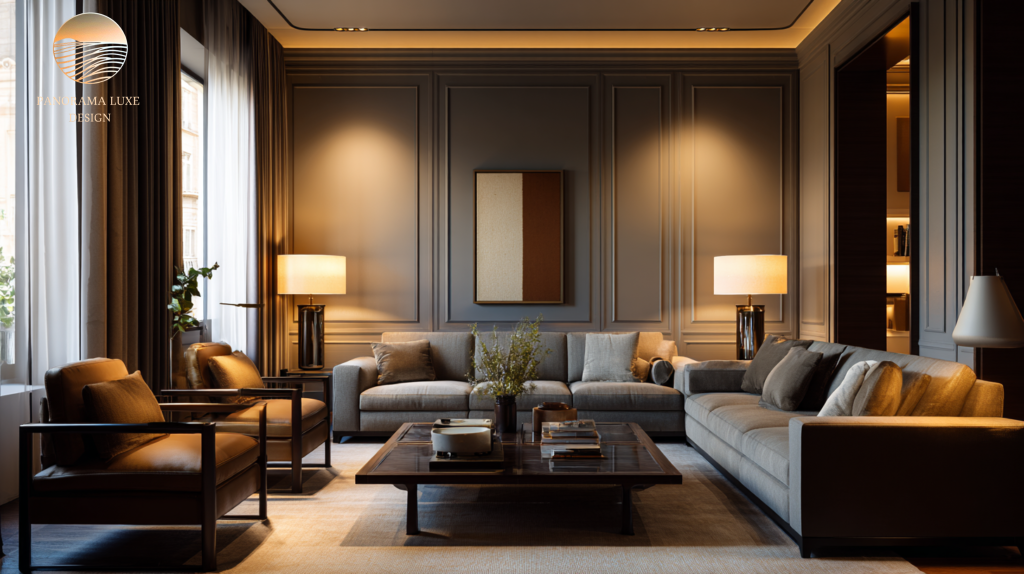
8- Three reliable high-end interior color schemes (with modern luxury character)
These aren’t “trends.” They’re proven structures designers return to because they work across architecture styles.
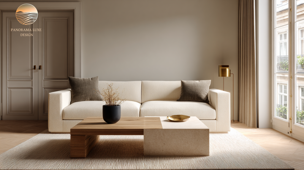
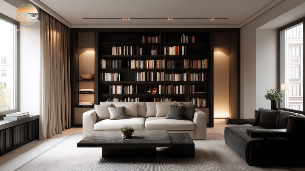
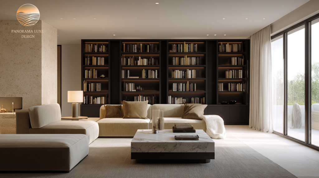
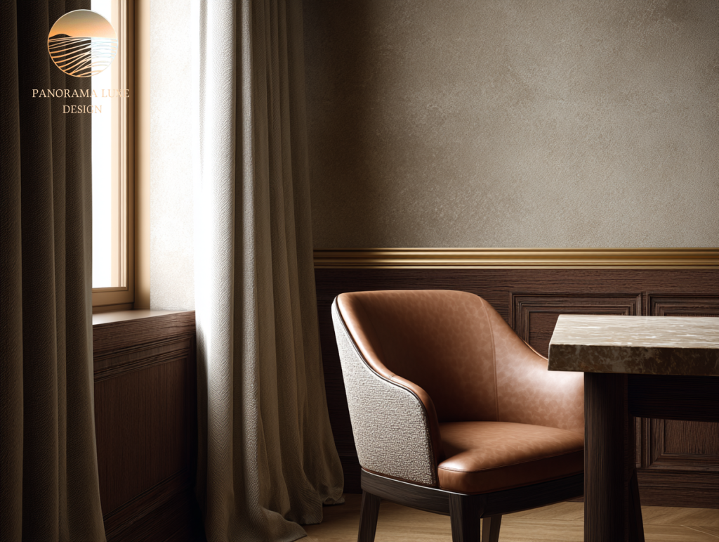
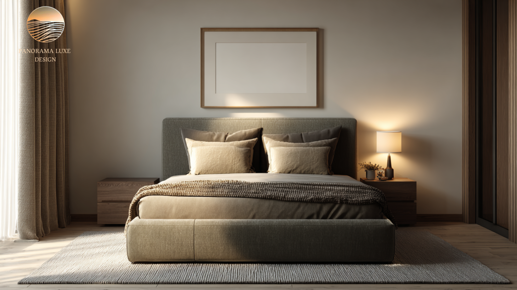
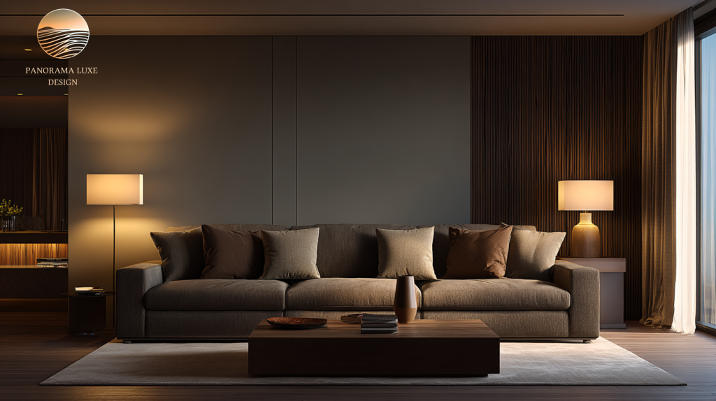
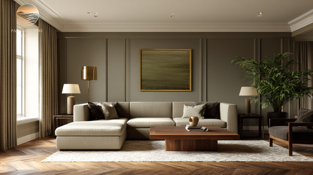
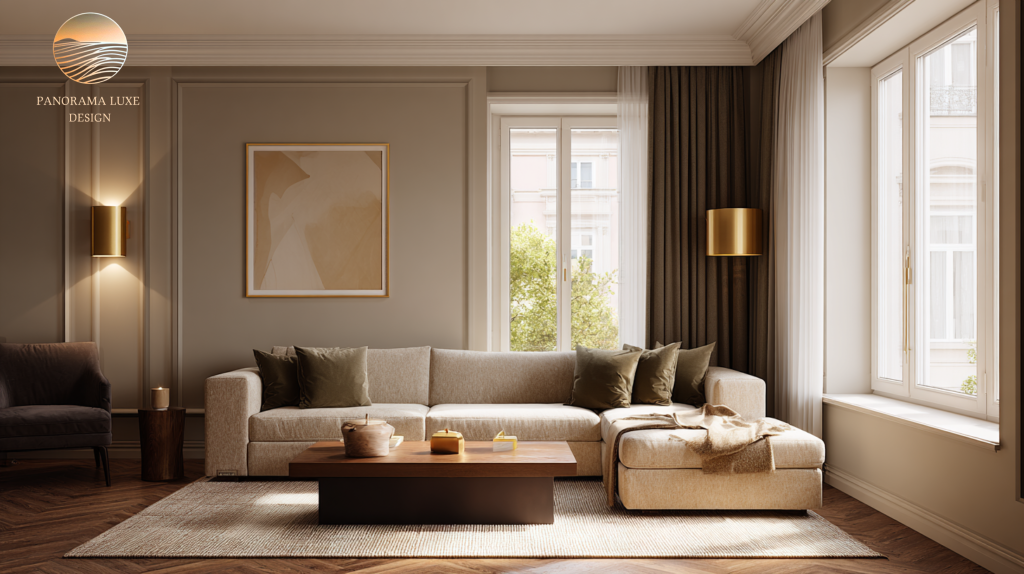
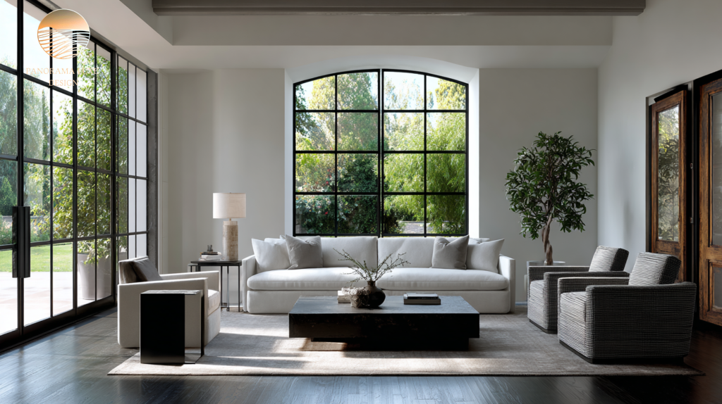
A) Warm Modern Neutral (soft, expensive, welcoming)
- Hero neutral: warm greige / stone-beige
- Supporting neutral: warm white (ceiling/trim)
- Deep tone: espresso or soft charcoal
- Metal: brushed brass or champagne bronze
- Accent: muted olive or clay (very sparingly)
Best for: natural wood, travertine, warm marbles, cozy minimalism.
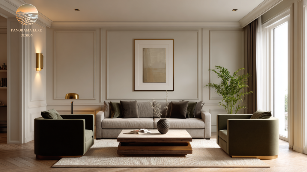
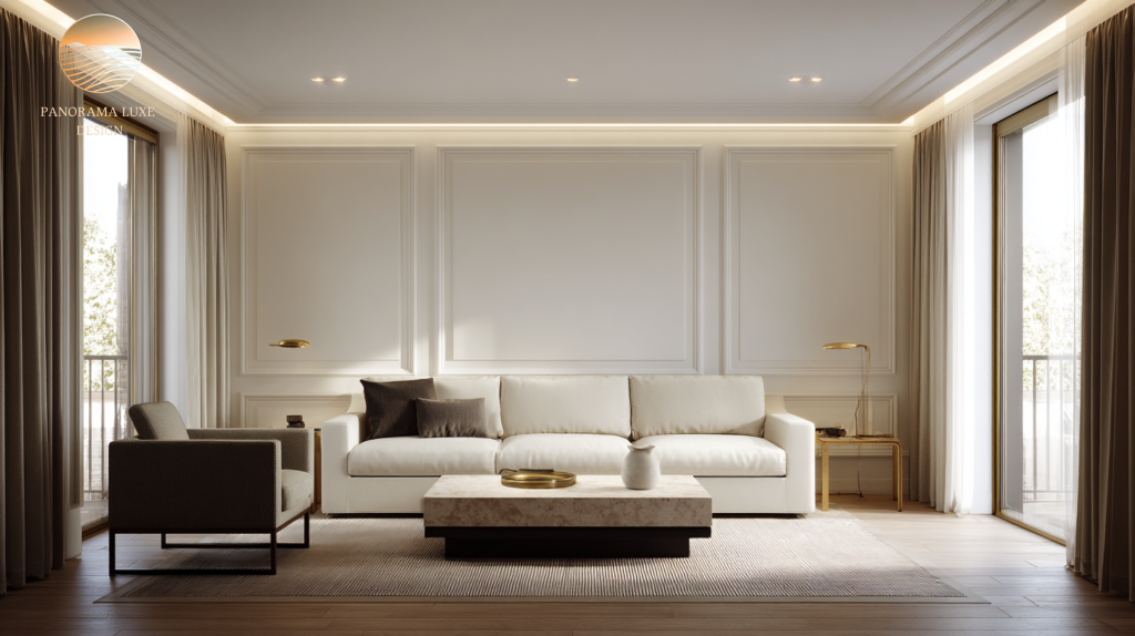
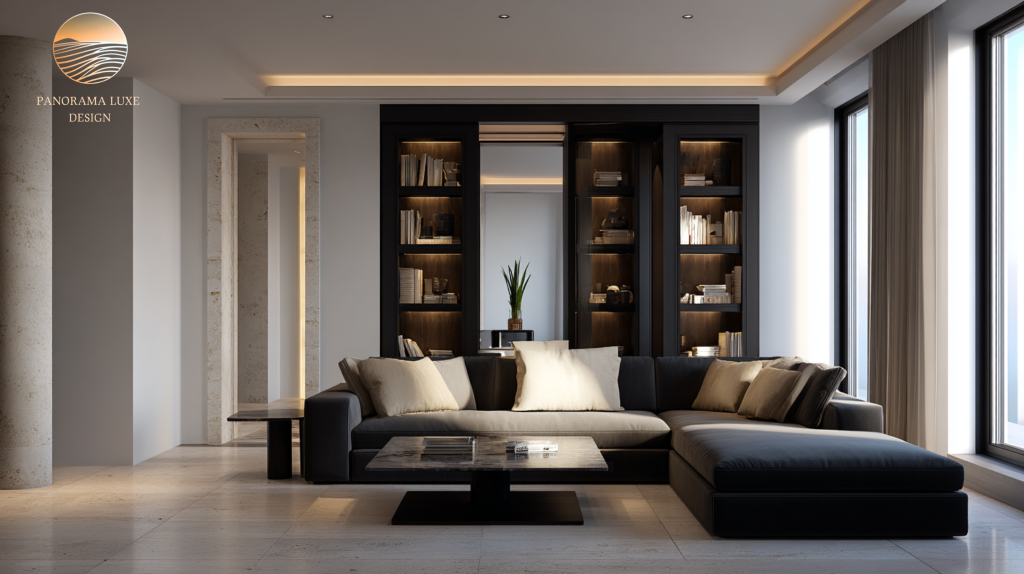
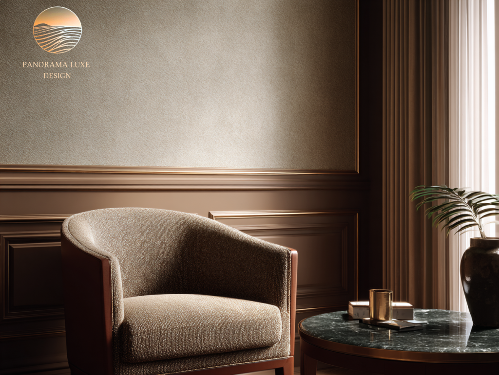
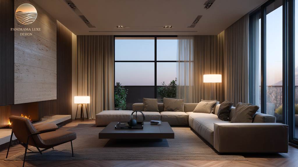
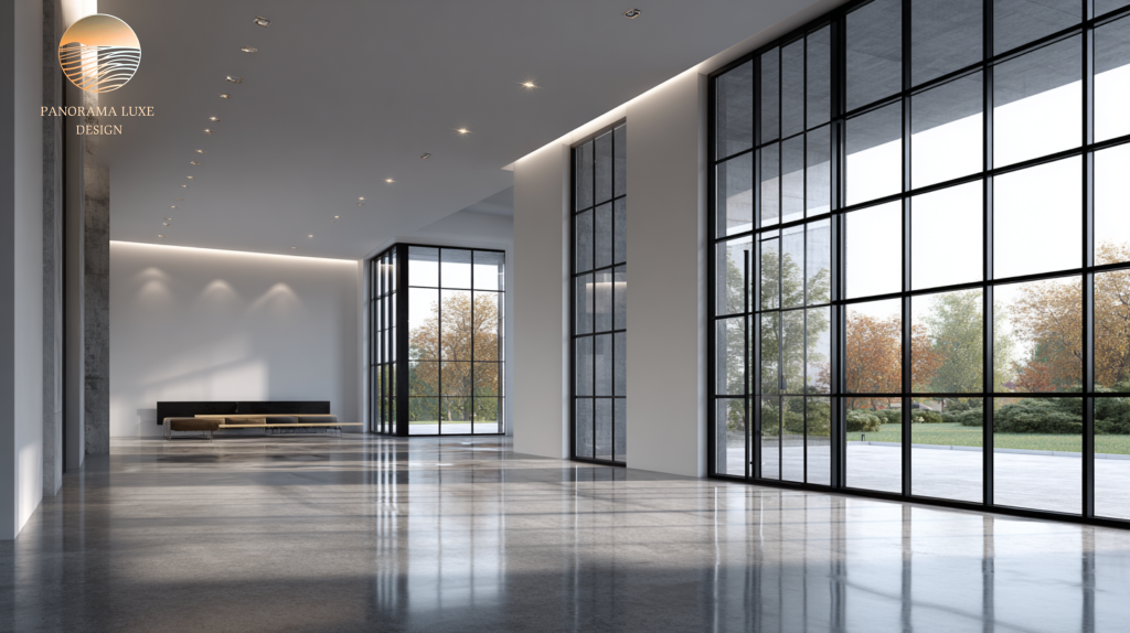
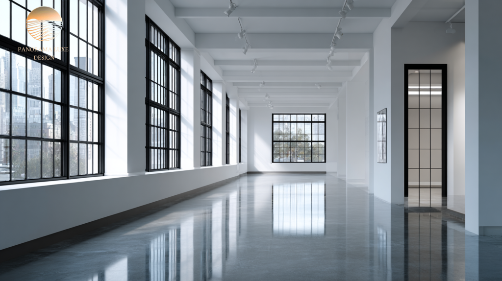
B) Cool Architectural Minimal (crisp, gallery-like, sharp)
- Hero neutral: clean soft white (not stark)
- Supporting neutral: pale cool gray (or vice versa)
- Deep tone: true charcoal or near-black
- Metal: blackened steel or polished nickel
- Accent: desaturated navy or smoky blue
Best for: modern lines, concrete/stone, large windows, strong geometry.

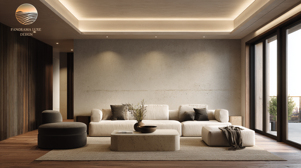
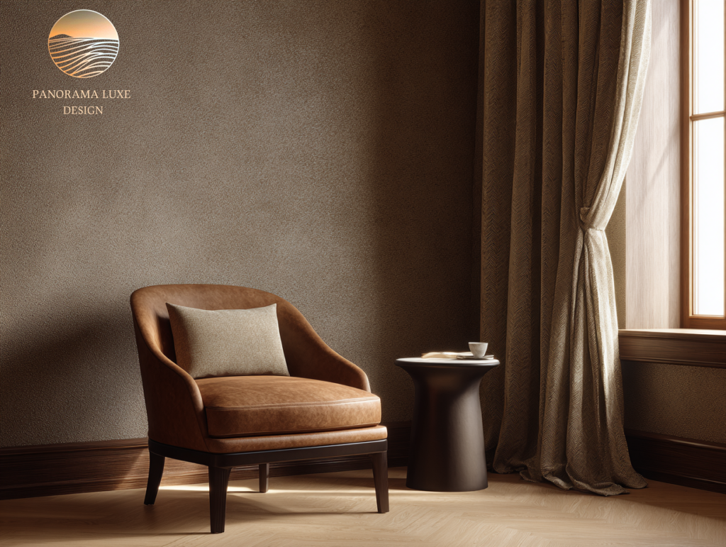
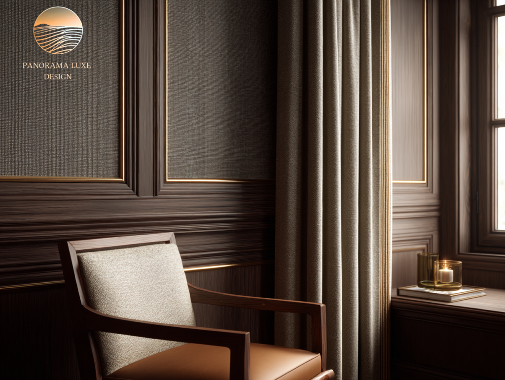
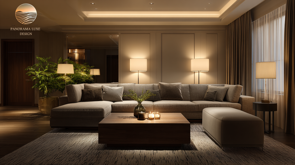
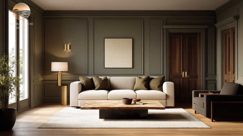
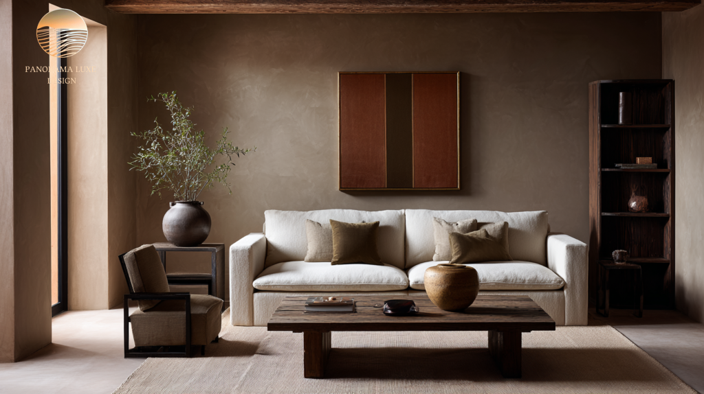
C) Quiet Luxury Earth (grounded, tactile, timeless)
- Hero neutral: taupe / mushroom
- Supporting neutral: creamy off-white
- Deep tone: umber / deep olive / chocolate
- Metal: antique brass or dark bronze
- Accent: terracotta, oxblood, or deep teal (art/textiles only)
Best for: layered textures, wood-heavy homes, “warm modern” or transitional spaces.

9- A professional checklist for choosing a luxury interior color palette
Use this to think like a designer:
- Inventory your fixed finishes (floor, stone, cabinets, metals).
- Declare undertone direction: warm or cool for your base.
- Pick one hero neutral for the largest surface area.
- Pick one supporting neutral that shares undertones (trim/ceiling).
- Choose one deep contrast tone for grounding (not everywhere).
- Select one metal family and commit.
- Design contrast intentionally: light base + dark anchors + bright highlights.
- Let texture replace extra colors (linen, wool, leather, wood, stone).
- Test in your lighting morning, noon, and night.
- Live with samples for a few days before committing.
Final word: luxury is a disciplined system, not a color list
A strong luxury interior color palette is less about “finding modern luxury colors” and more about building a controlled framework that makes everything else look more expensive; materials, furniture, art, and light. The best high-end interior color schemes rely on restraint, contrast that’s measured, and undertones that cooperate. Do that, and your neutral luxury interiors won’t just look good now; they’ll still look right years from today.